
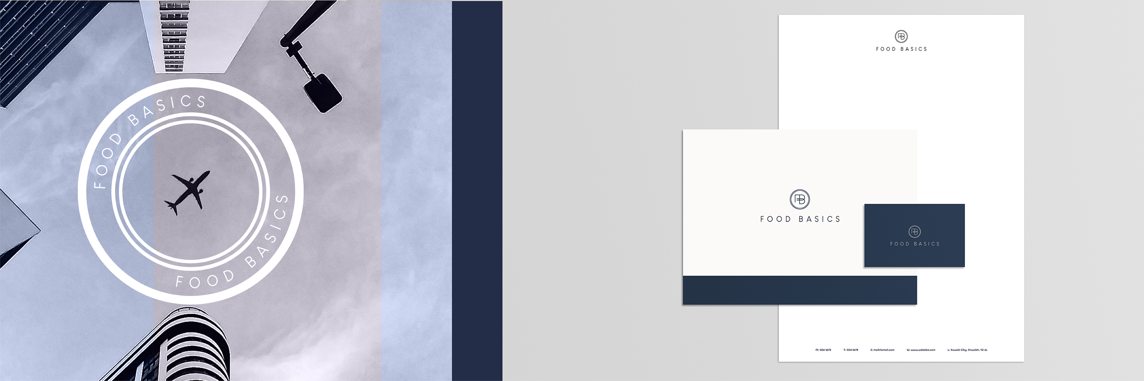
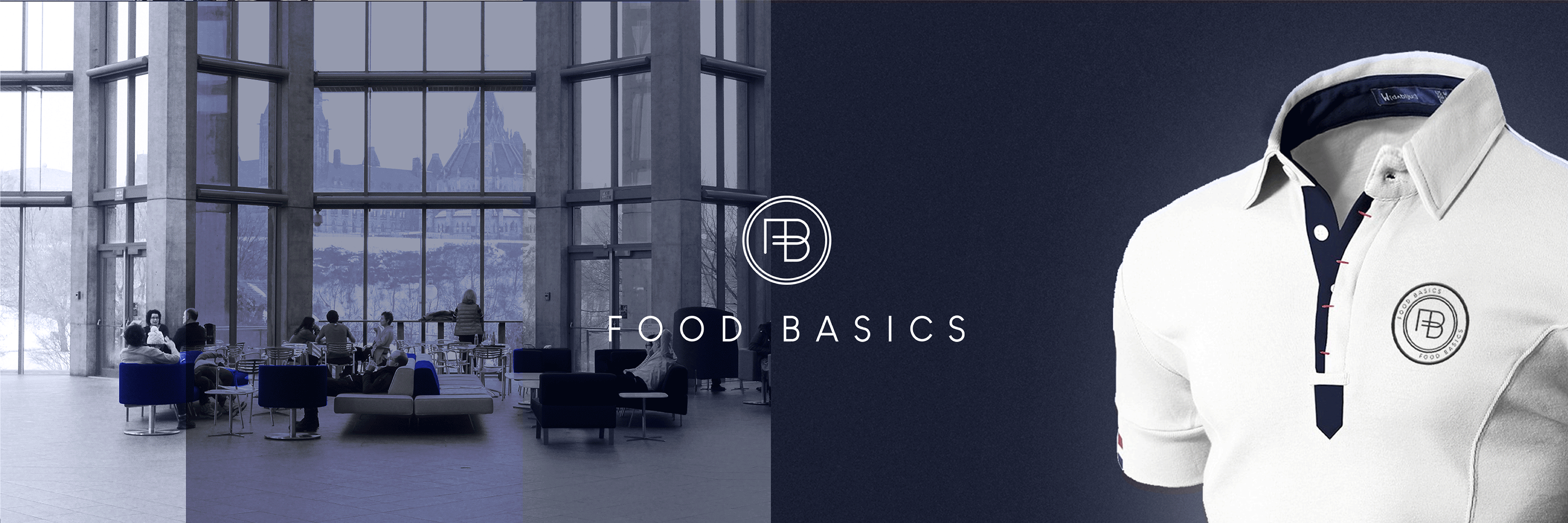
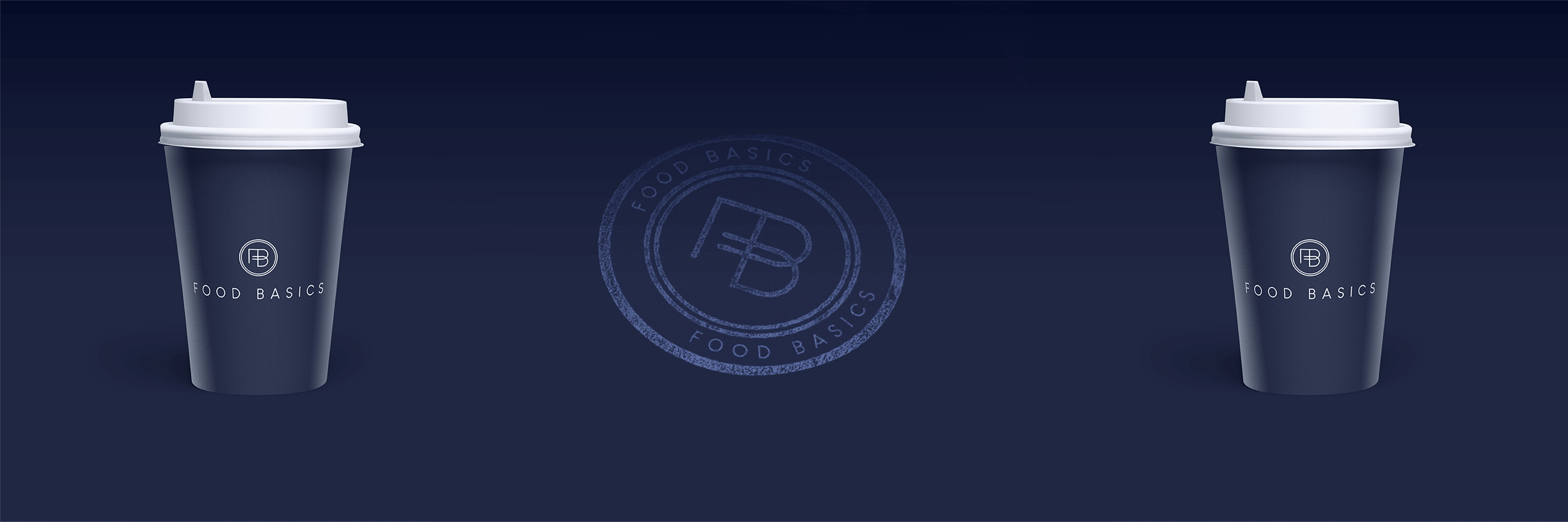
Food Basics
A food distribution company that handles transporting and storing food as it travels from worldwide producers to distrubute it locally.
The client’s request was to use the blue colour to relate with their main company. We worked with the blue and added white and grey for the colour palette. We came up with a professional and pristine look.
The logo design of integrating the letters F & B together as the company connects their clients with a wide range of food & beverage choices. we wanted to show the link as they bring things together.
Project requirements
Logo design
Letterhead, Envelope & business card design
شركة توزيع المواد الغذائية التي تتعامل مع نقل وتخزين افضل المواد الغذائية أثناء سفرها من المنتجين في جميع أنحاء العالم لتوزيعها محليا في الكويت
طلب العميل استخدام اللون الأزرق ليتناسق الشعار مع شركته الرئيسية. لقد عملنا مع اللون الأزرق وأضفنا الأبيض والرمادي . ترمز هذة الالوان للمهنية والرقي
تصميم الشعارعن طريق دمج الحروف معا حيث تربط الشركة عملائها بمجموعة واسعة من خيارات الأطعمة والمشروبات. أردنا إظهار رابط الترابط أثناء جمعهم للأشياء معا.
متطلبــات المشــروع
تصميم الشعار
تصميم رسالة رسمية, تصميم ظرف وتصميم بزنس كارد
Other Projects Done by SOL Design


